
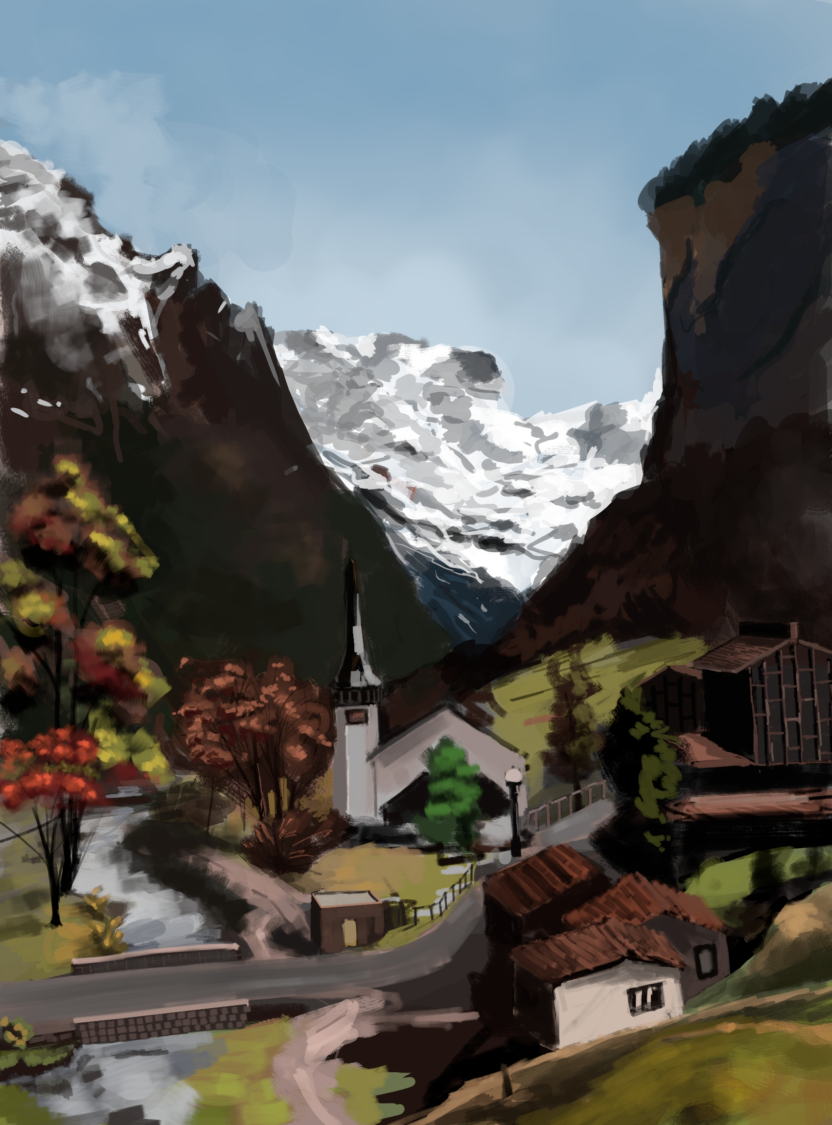
I share it even though it’s not very good only because I’m using internet as a my journal lately. lol. I hope you don’t hate it too much!
You must log in or register to comment.
Looks good for me. Be aware that while you see more the imperfections, we see more then general picture.
I think it’s really good!
There is an often-repeated story about Bill Watterson (the Calvin and Hobbes creator) destroying his first 500 paintings. That’s how much practice he thought he needed before his work was good. If you are not satisfied with your work, then just consider this one of your 500 pieces and keep going!
Don’t be so hard on yourself.
You actually attempted it and did a good job while also developing your skills as an artist.
I often think of doing the same but never get to that point … and most people are the same. You achieved something most people haven’t but wished they had.
And if you keep making more, they will only become better. I’m happy for you and I look forward to seeing more.
Thank you for nice words. I look forward to more feedback as I share my future drawings here.
Are you kidding, that looks awesome! Is this Lauterbrunnen?
Oh, I just looked and yes it’s probably that. I didn’t completely follow the reference picture but that church building looks like it’s from Lauterbrunnen.
failinglearning(possibly still miserably, but that puts you in company with Van Gogh, etc.)
Keep growing!
lol, not like Van Gogh, poor soul had been dealt with a very difficult life.
I like this! I like it a lot, and I’d be proud to have painted it. The general aesthetic appeals to me, and I’m particularly fond of the left half of the valley. I love the color work, how loud the highlights are against the darker colors without being offensive to the eye; it’s a very visually striking style.
Only read if you want constructive feedback:
If I had to guess what’s “wrong”, I’d say that it’s that the detailing over distance is inconsistent. You’ve got some things that are sharply detailed at a far distance (the church) and other things that are loosely detailed at that same distance (the trees). The line work also seems a little wobbly (speaking as someone who does vastly worse line work). The last thing is that the very far off snow is really, really, really bright, which seems to suggest to the eye that it’s much closer than it ought to be.
I agree with you assessment. Consistency in detail is an issue here. I changed my mind few times while painting it, whether to make the details loose or closely knit.
I’m looking at it with fresh eyes and I can’t help but notice that it’s mostly natural things that are loosely detailed and everything built, save for the road, is sharply detailed. Was that on purpose?
haha, no. It’s just lack of commitment, I wasn’t sure where I wanted to keep the focus so everything came haphazardly. When I see finished art pieces on the web, artists usually mention the time they spent on it. It’s like 10, 12 hours sometimes. I sort of give up after 2 hours. Very rarely I paint for 3 to 4 hours and difference is noticeable in those pieces.
That’s a perfectly valid art style! This is pretty much me when I work in physical media because I can’t devote much time to it and doing it over multiple sittings takes more planning than I want to do. For some reason, I’m more comfortable taking my time with digital, though.
art is permission to fail.
and you don’t get better without failing a lot.
We are our own worst critics, no one in this thread is zooming in and seeing all the things you know you did wrong. as a finished work it is pretty good.

