Hello everyone,
Haven’t deal with my dashboard for a long time so want to take advantage of some recent features like visibility condition (not sure that’s proper wording) to create a new clean adaptive phone and tablet dashboard, but missing inspiration so curious how yours looks like. How did you organised it? which card (also card combination) is your favourite?
You must log in or register to comment.
deleted by creator
Cool! Which automation hides/shows them based on location?
I believe playing with visibility would be the easiest way
Right, thanks!
deleted by creator
Thanks for sharing
deleted by creator
I split mine up into pages with buttons at the top

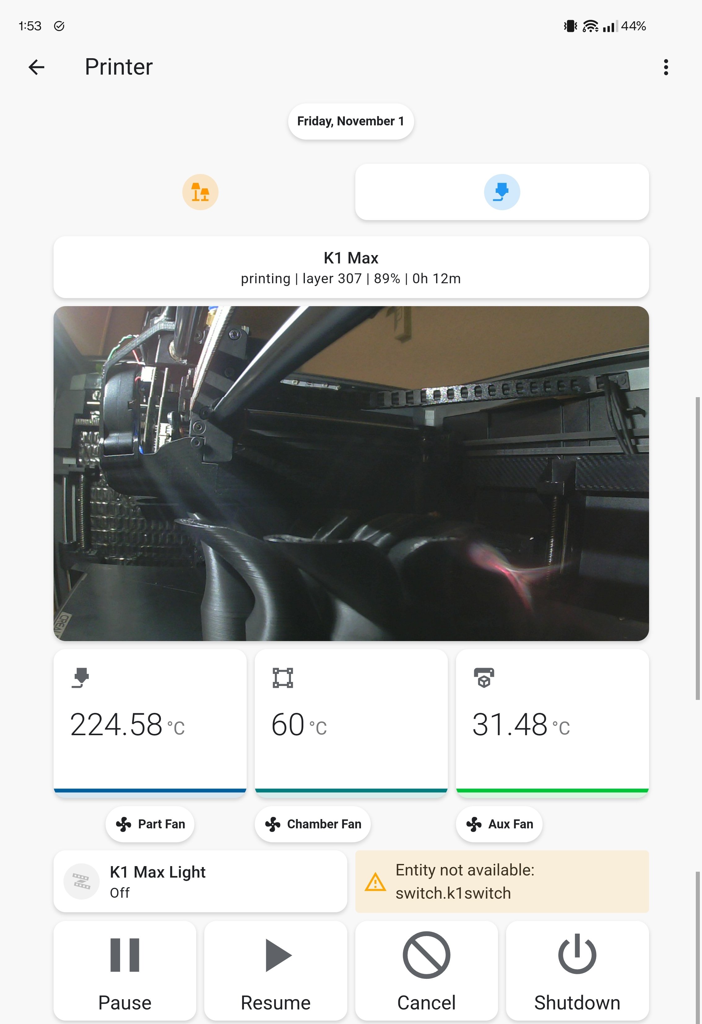
Nice, that’s remind me that I have also a printer card/page to create
I’ll just re-share mine from last time.
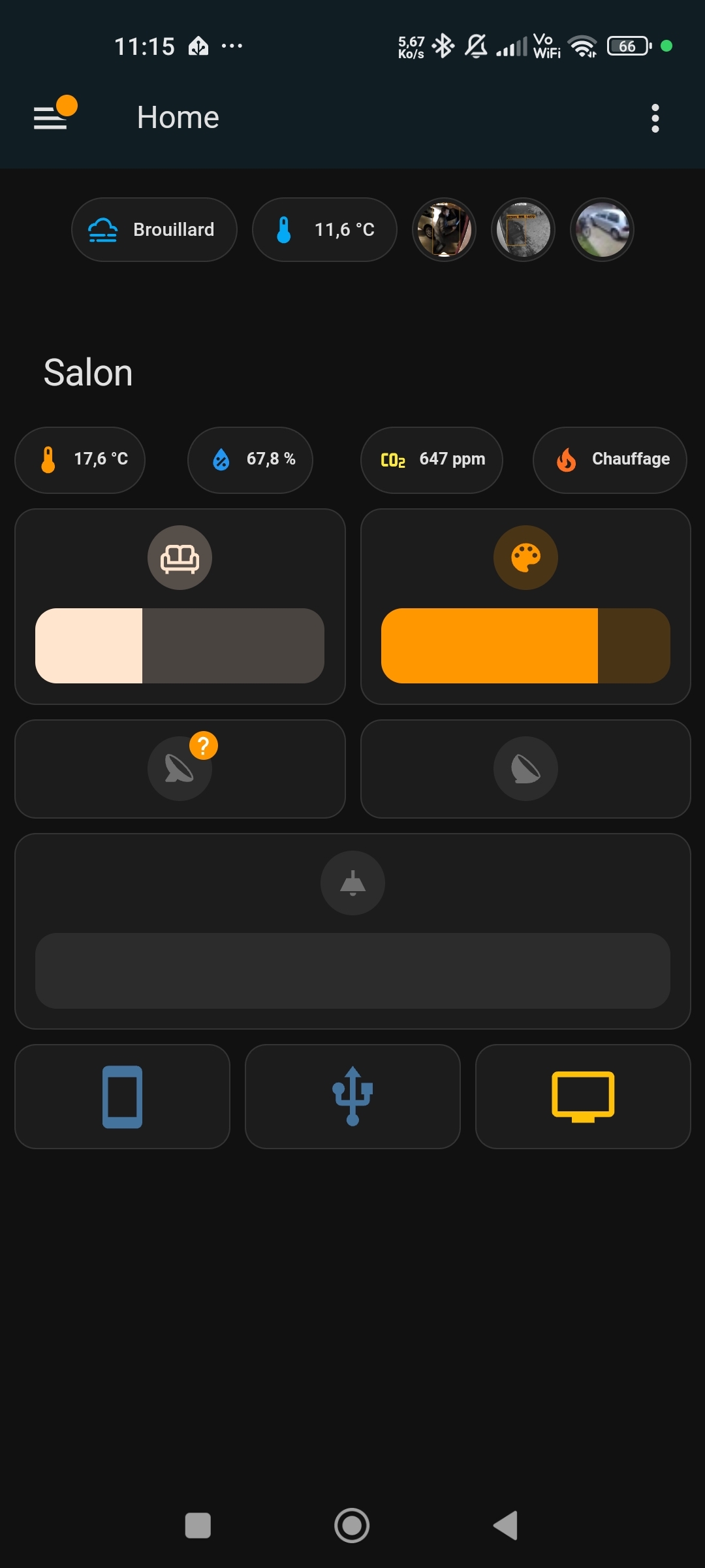
I tend to use the Horizontal Stack. On a mobile device, I just get one stack per line.
And on bigger screens, I get multiple stacks to make use of space.General “Going out” page:

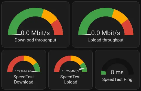
Internet speedtest page:
Thanks
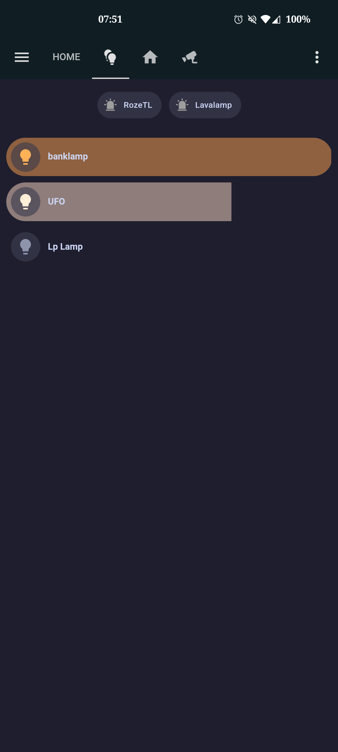
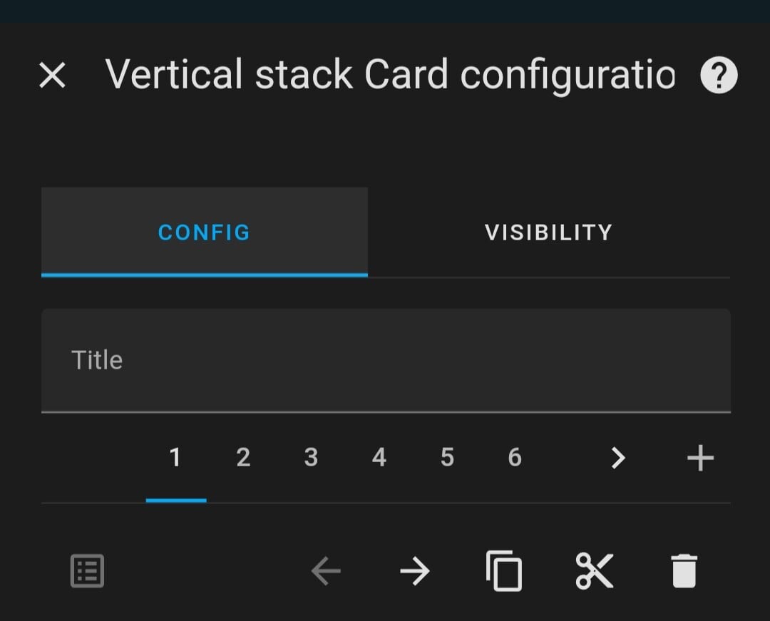
I started using bubble cards in vertical stacks, alongside the catppuccin theme.
I have forgotten about bubble card, thanks. Started a test with a vertical stack then insert horizontal stack. I’ve tried with mushroom card but might replace those with bubble card
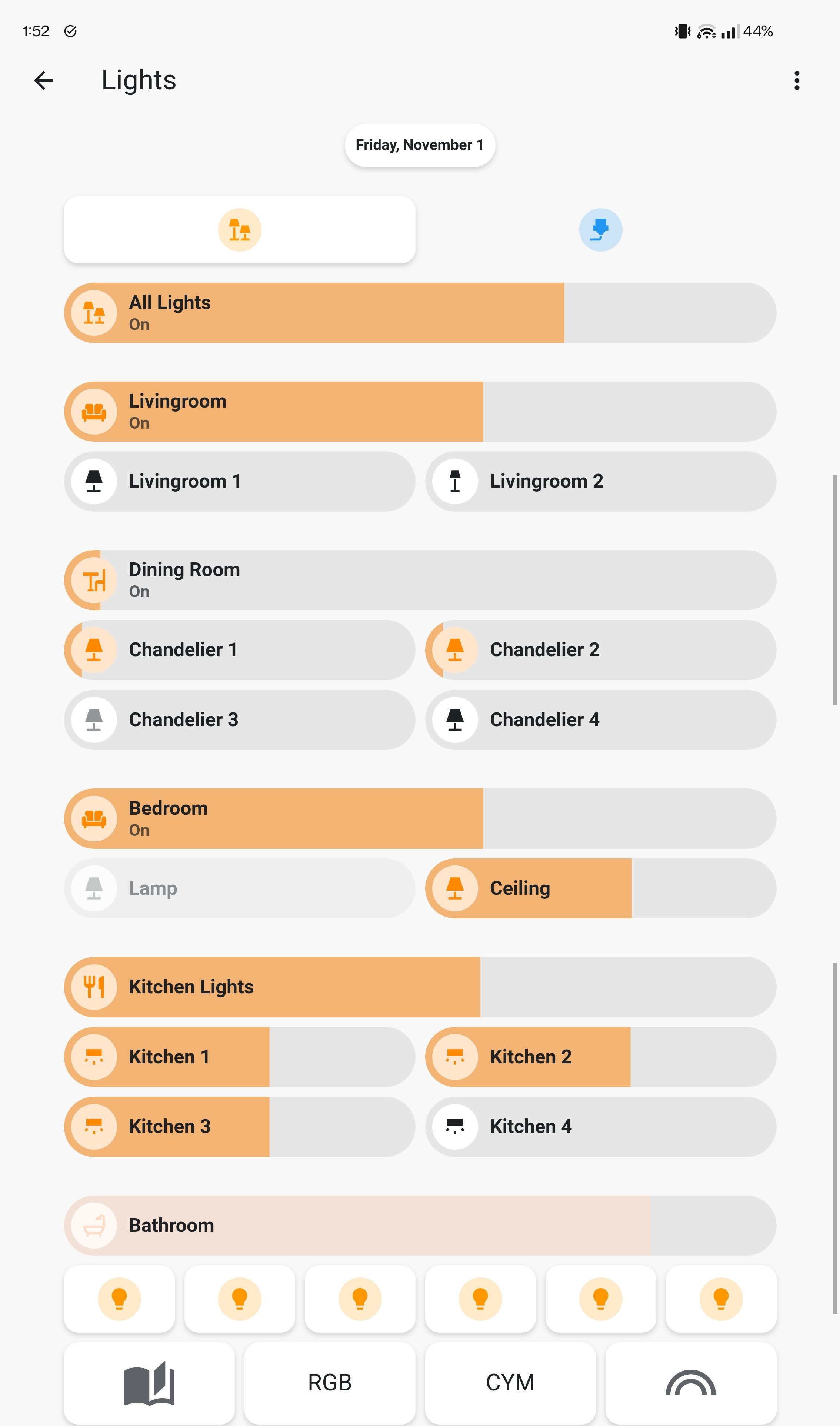
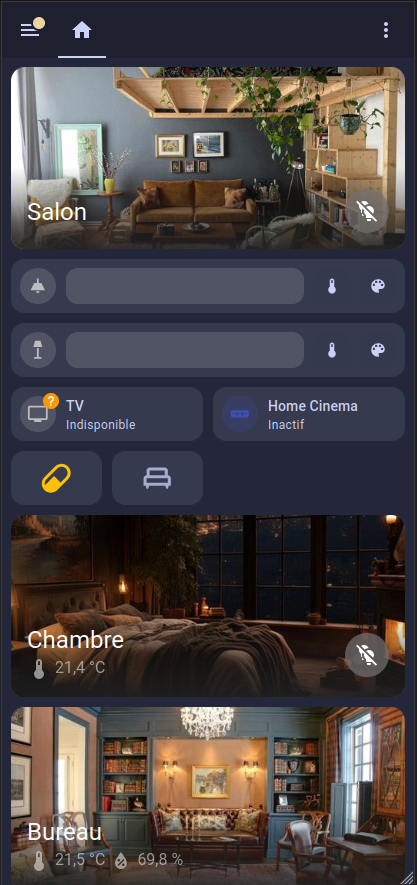
Here’s mine, using a fair share of Mushroom for the light buttons, the “Room” tiles are actually pretty great!
Ça rend bien, merci