

“We’re a tech company now!” logo
A design consultant probably sent Jaguar a six-figure bill for this new logo, you know.
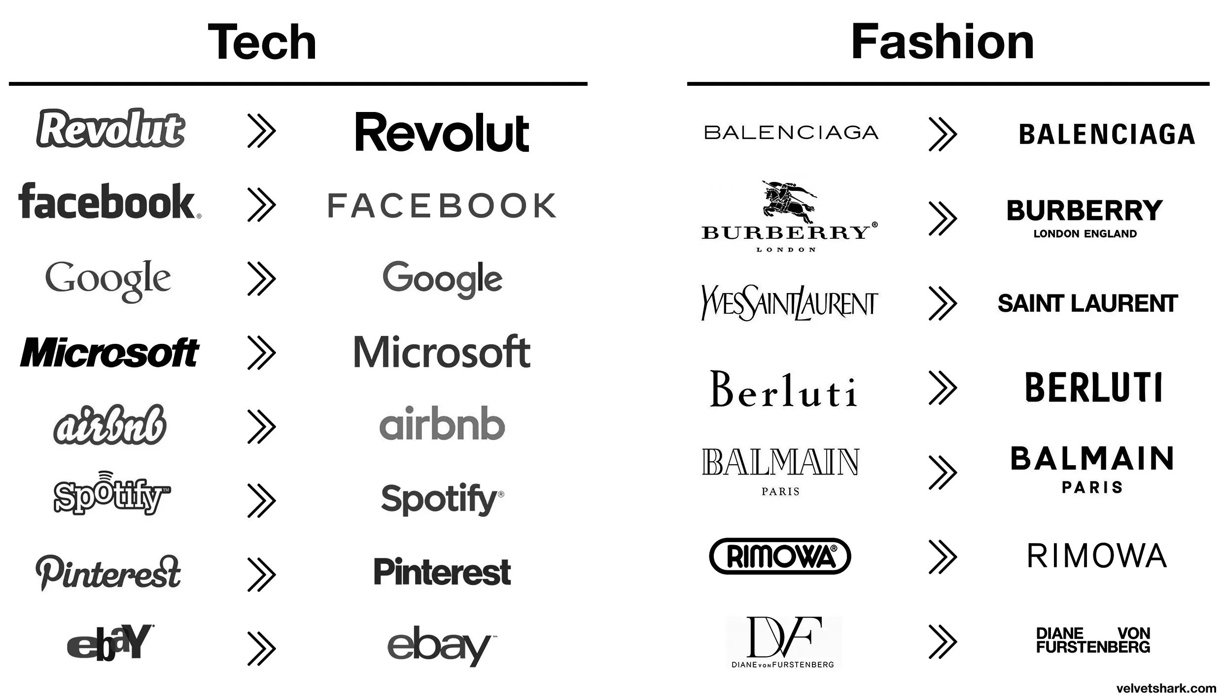
Those old fashion logos are actually sick. Concerning that an industry that sells style would make these their logos.
Except eBay, that was always trash.
Better:
- Revolut (though a fintech company named after a revolution lacking the charge at the end is still moronic in several ways)
- airbnb (from awful to meh)
- Spotify (same)
Worse:
- Pinterest (original fit the platform and what it is/was pretty much perfectly. Current is meh)
- eBay (both are bad IMO, but at least the original was bad in a playful and eye-catching way. The new one is just more meh
- Burberry (the stag was notable and signalled a history of old-fashioned quality that’s suitably rugged. The new one is meh AND insecure about people knowing which London they’re from)
- Rimova (yet another fashion brand apparently afraid of being noticed
- DF (from one of the best and most fashion-appropriate logos to an absolute eyesore and kerning nightmare that invites vandalism)
- Jaguar (From absolutely iconic and great in every way to even uglier than the new DF one. I hope whomever came up with that got both fired and beaten and I’m a pacifist.)
The rest just go from meh to slightly different meh 🤷
I liked the old aibnb one.
Microsoft went from “boring with a bit of attitude” to just plain boring
Spotify and EBay made the right choices here, the new logos are way better.
All these minimalist labels save .0005¢ every time they’re printed, probably even more on promo booths, banners, and the like.
Aaaah then indeed that makes sense (and this is not ironic).
Oh, I wasn’t being entirely serious, though there is an element of truth to it. It probably is a measurable cost savings over the scale of the business.
I still think these unremarkable corporate logos are boring AF. Just makes them visually soulless along with just being corporate soulless.
JaGUar

>New logo is soulless slop
Every single company
My favorite shit logo redesign is
KИ
I can’t believe anyone thought that was a good logo…
Makes it easier to forget them and not being able to keep them apart. That’s really great for us. Less ads in our brains.
/uj Technically this is their new logo:
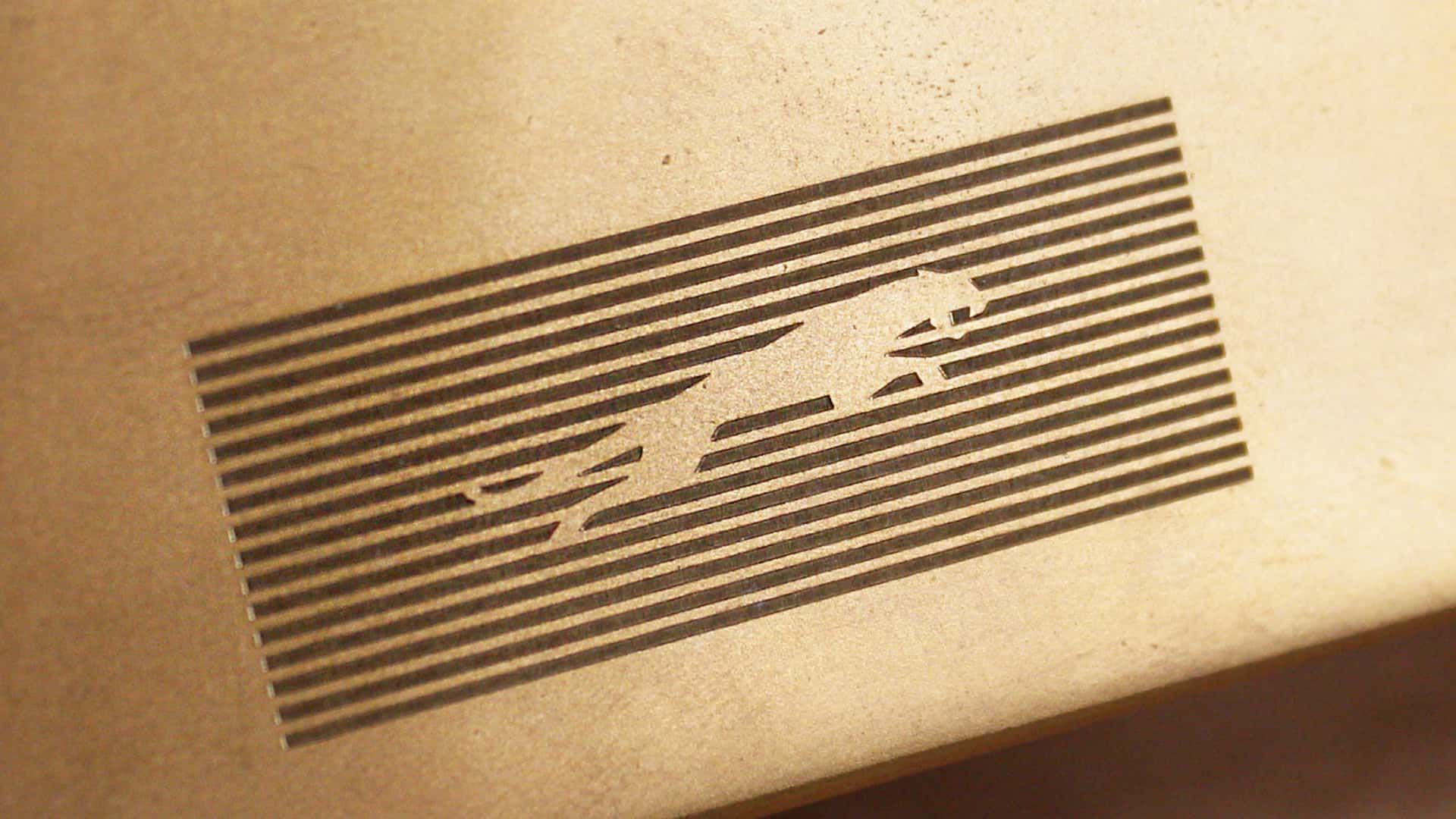
J a G U a r is just their new typeface (I think that’s the name?); and apparently/allegedly is to make the pronunciation closer to UK English, rather than American.
Either way, though - it’s still…
/j
…pReTtY fArKiN’ sToOoPiD.
I would have guessed that was a Puma logo.
Slazenger
You spell stoopid with three O"s. Maybe your the stoopid,
Yeah that’s pretty dummb
Jaguaren’t
Somewhere in Jaguar HQ, a marketing firm convinced the CxO suite that the most pressing problem facing the company was that the logo was wrong. So, in the interests of the shareholders they write off the goodwill value of the existing brand and dump millions of euro into this.
Hah don’t worry, the existing brand is utterly fucked now. One of the worst, most unreliable and badly made cars on the market
One of the worst, most unreliable and badly made cars on the market
But enough about Tesla.
Everyone circlejerks about this online but every IRL owner I’ve actually spoken to say it’s the best car they’ve ever owned.
Yeah, because who wouldn’t want to drive a car from a company whose quality control policy is “don’t” that does welding like this?
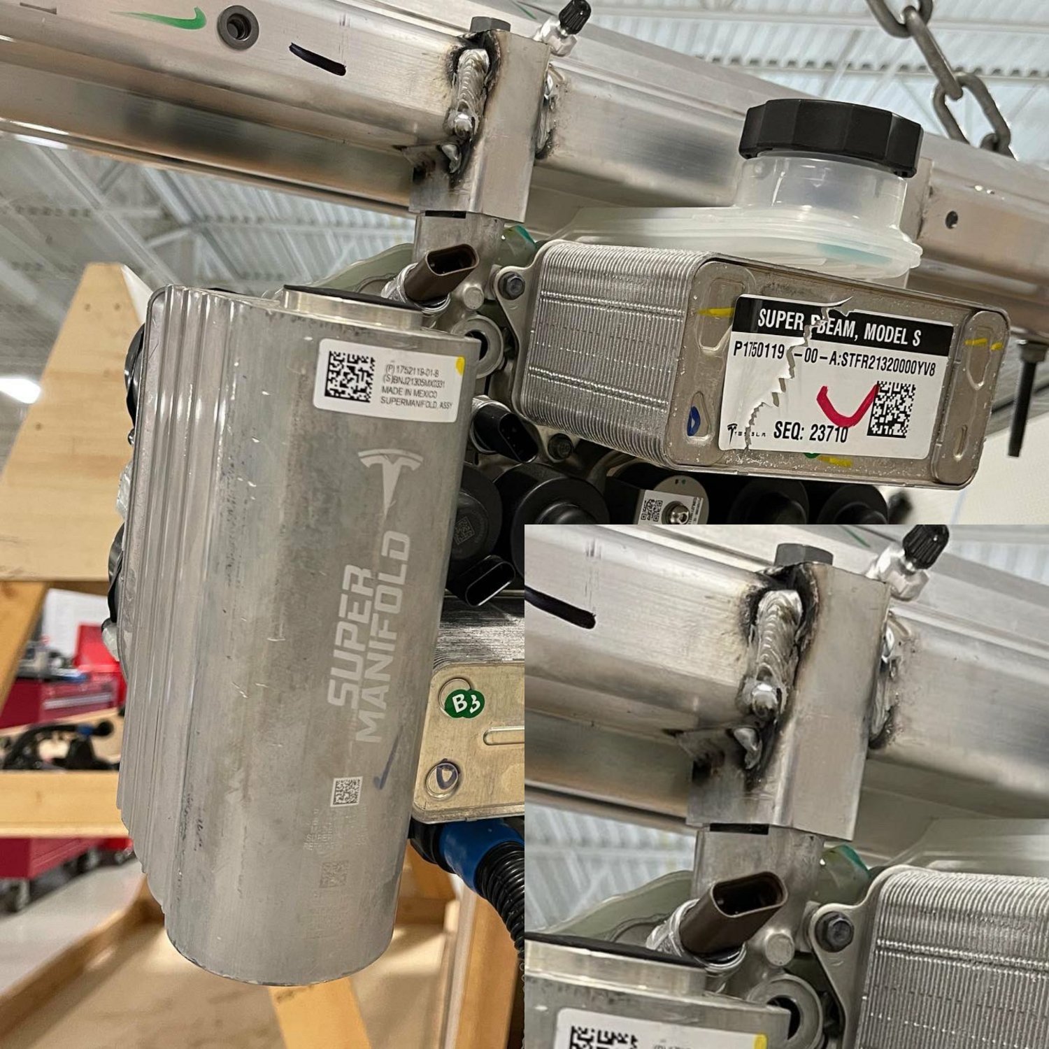
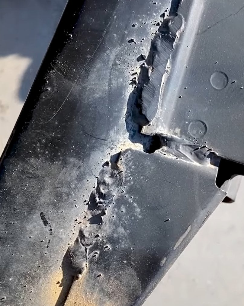

And fit things together this well

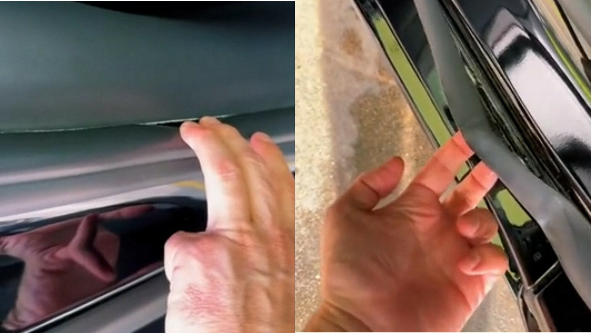
It may be quick and pretty to look at if you don’t inspect it closely, but it has the price tag of a brand new Aston Martin and the build quality of an 80s Yugo.
So, I’ve never owned one, but did a test ride on a con. It was the most plasticy, janky mess I ever sat in. Ok, a Hummer I once sat in was maybe equally bad.
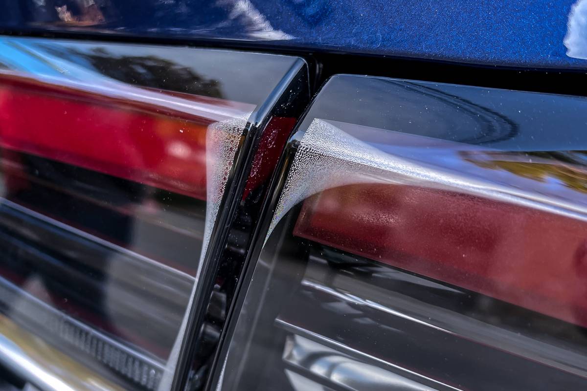
Every surface your hand could touch wasn’t fastened properly and moved in ways it shouldn’t. The door handles wiggled about. The touch screen replacing the middle console - absolute nightmare. The swinging door got stuck halfway.
You could say, all of this is the interior and not the engine. But it’s what the user interacts with. If I can’t trust the manufacturer from my experience with the door handle, I’ll have a hard time trusting them about the brakes.
Blimey, maybe their production quality varies based on which factory it was built in (or Euro NCAP have better quality control regs), the one I’ve been in was lovely!
I don’t know, I’m in Germany
Just buy an old style one and replace the new one with it if you just have to have a jag
GUys I’m from
20402035, here’s Microsoft’s logo
MS corporate comms army did a sik job getting across those inscrutable monolith vibes, I bet when it launched they all clapped (even though clapping is in performance reviews)
BONUS: heres Amazon, Faceberg and Nvideo too (yay diversity)
spoiler


We’ve gone full circle again

They went from luxury car company to mediocre smartphone brand
What are they selling now 🙄
Cheap vapes and gucchi knock offs apparently.
I fucking hate this minimalist design trend more than it is probably reasonable to hate an aesthetic. It’s got the personality of unfinished drywall.
Honestly I think unfinished drywall has more personality. It’s utilitarian and rough around the edges, without the shiny surface veneer.
That new Jaguar logo is like somebody took a beautiful old house full of exposed brick and wood work and put a coating of white paint over everything.
It should be those puprple and yellows of Corporate Memphis

You’re all making fun of it but this new style did exactly what it intended to do. Everyone is talking about them now.
Yeah, for a whole 2 hours, until everyone moves on to bitch about the next thing and then Jaguar are stuck with the shitty new logo no-one recognises for long after that.
Why would no one recognize it? Hardly the first time they’ve changed their logo.
But it’s the first time they’ve made a change as drastic as this. I can recognise any Jaguar car out there even if I know fuck all about their cars because I can see the jaguar design on the car.
Now people will have to squint to make out the word JAGUAR in that shitty font? Bad move.
It’s not the first time they’ve made a “drastic” change.
As a matter of. They’ve had a logo similar to this before in the 50’s. With just the word “Jaguar”.
You have the world’s combined knowledge at your fingertips. And you choose to be ignorant and blur out something so stupid as “But it’s the first time they’ve made a change as drastic as this.”
Fair enough. I just don’t care enough about Jaguar to look this shit up tbh
If only they sold stuff that the people talking about it could afford in the first place, maybe that’d boost their sales.
First step is increasing brand recognition. No one will buy if they don’t know you exist.
A brand that has been known for nothing but luxury sports cars for decades, including by people who don’t even follow car culture, is hardly one that would need to increase brand recognition. I’d expect that from a new company, not one with nearly 80 years operating under the same name
Did you know. That every single year. Millions of people are born that has never heard of Jaguar. Because why would they?
Last time I ever heard someone talk about Jaguar was 20 years ago when they sold their f1 team.
Prior to that. I have not given them as much as a single thought. So yes. Them changing their logo certainly did what it was supposed to do. Get people to talk about Jaguar.


![You know what, fuck you [un-Jags uar icon]](https://lemmy.world/pictrs/image/c1e5def3-4f79-4ee4-b74e-3672dac8df0e.png)