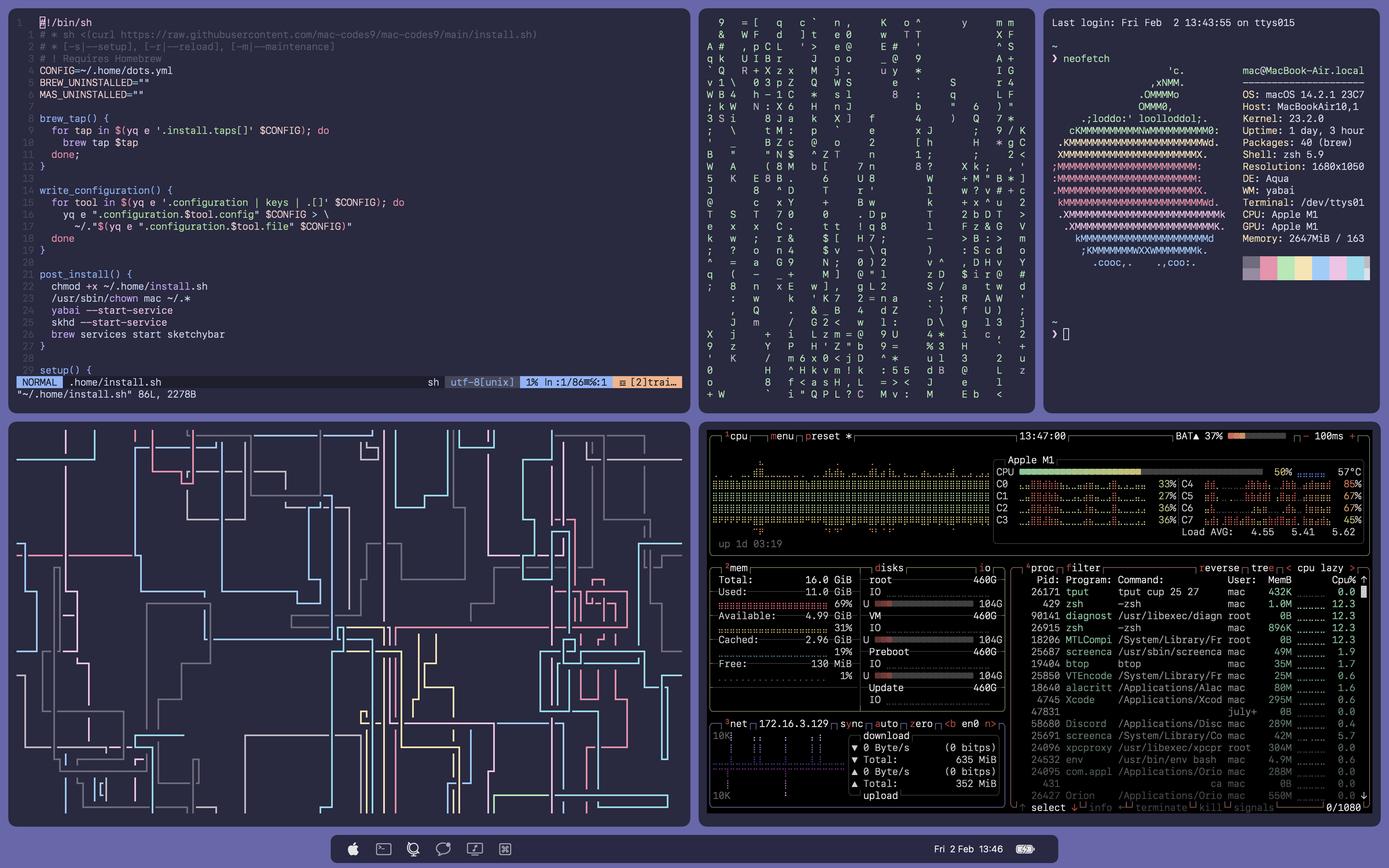
Nah desktop mothership, server star command and laptop UFO.
Programmer, Skateboarder & Aspiring Musician.
- 6 Posts
- 44 Comments
I like having similar tasks on the same workspace separated by mission control.
So I’d have my programming stuff, editor and browser, then maybe an issue tracker on workspace 1 with mission control to quickly switch between the two. I guess the dock might work for this use but it’s nicer to have the context of which apps are in each control space.
Then in workspace 2 I have my calendar and reminders on different mission control spaces so I don’t have to have them side by side and can benefit from a more full window size.
TLDR: minimise workspace count by grouping tasks of similar context.
I feel like UFO would make more sense for laptop due to it being portable, but I get it is because the desktop is Alienware
I like to take a look through it every once in a while but most of the apps are for people who download mobile games, dating apps and various entertainment sources. I don’t watch much content on my phone, unless there isn’t another option, and I avoid mobile games for the most part so most of what shows up on the home page is relevant to general masses but not myself.

 2·7 months ago
I think it started with females who had small front pockets, so the back pocket or placing it in the bra was the only choice. I remember everyone claiming rumours that phone vibrations could cause breast cancer so the butt pocket seemed like a better choice.
In regards to your sitting question, I imagine a few people have sat on it by accident, as long as you don’t have an obscenely large phone it shouldn’t cause any issues.

 1·7 months ago
Some people like to put it in their back Pocket

 1·7 months ago
I didn’t say this was the direction the phone market was moving though. I stated this is how their devices are supposed to be used.

 1·7 months ago
So? What does that have to do with Apple pushing this philosophy? It’s not their fault there isn’t an equivalent in the Android world.

 1·7 months ago
Surely the best option is voiceover for key notifications on the watch?
Yeah an extension is no more trustworthy than the source providing it, network level adblock which you can monitor completely is probably the correct route

 3·7 months ago
I personally believe it’s not supposed to be pocketed but to be backpacked. They’re trying to encourage less phone usage, you should use your watch for immediate notifications and only get your phone out to use it for taking a picture, drawing something with the apple pencil or another task that requires a phone. Most everything else should be done by the watch though.

 1·7 months ago
I agree, I think someone that’s into minimalism and sees the appeal of an iPad or an iPhone, would be happier to choose this, especially if it shares features like apple pencil support. If there isn’t apple pencil support then I’ll be upset.

 15·7 months ago
Also you’re clearly not apple’s target market so you being frustrated by their choices is negligible to them.

 9·7 months ago
I haven’t tried for a while but I’m pretty sure you can store your own music files on all Apple devices and listen to them via Apple Music.
Yeah however for mass adoption this is a terrible idea, there is already the extra step to choose an instance versus a regular social media that is just one link and one button.
I know for people like you and I choosing an instance isn’t that big of a deal, nor is an extra extension (though i try to use as few as possible) but for a regular user it might cause issues.
The issue with an extension ls is it requires an install, getting everyone to install one extension is a hard task.
I didn’t say Apple apps are the best though? Nor did I say this decision hurts consumers.

 3·8 months ago
UTM can definitely run windows 11 on arm.
Which to be fair is the issue, the issue isn’t the ads it’s the tracking. That can be disabled without much work.


Yeah I mean you’re still people with emotional processes who understand social queues. Not like you’re robots who can’t process these things.